Presentation

ECAL is introducing a new master’s degree in Type Design as from the 2016 academic year. Unique in Switzerland, this two-year programme gives graduate students with a Bachelor in Graphic Design an opportunity to develop projects in the long term. This training provides privileged access to one of the flagship disciplines in Swiss graphic design, relying on ECAL’s expertise in this field as the first Swiss school to have integrated digital typography as part of its curriculum.

With the support of renowned professionals and academics, students explore fields ranging from corporate typography to experimental research, focusing on creativity. They work on techniques specific to typeface design (calligraphy, work on curves, construction, digital drawing), including the development of multi script font families. They acquire and develop a sharp and thoughtful eye, technical and methodological skills and an ability to produce quality digital fonts with efficiency and rigour (mastering, scripting) as part of courses and workshops where their projects are assessed and commented by experts invited for conferences and individual interviews. Finally, they attend lectures and research sessions around concepts ranging from the prospective to the historical, including aesthetic and legal aspects, which are given concrete form through dissertations, online or paper publications and even exhibitions.

The skills and projects developed throughout the curriculum serve to produce a portfolio that meets the highest standards. At the end of their curriculum, having acquired a solid typographical culture, students will have the  opportunity to apply their skills either as part of a company or in a self-employed capacity.

Language

English

Qualification issued

Master of Arts HES-SO in Design, major in Type Design

Yearly fees (materials included)

Fees detail

Length

4 semesters

Credits

120 ECTS

Useful links

Admissions Contact ECAL Typefaces

Equipments & infrastructures

Open Space MA Type Design Printshop Digital printshop

Learning Objectives

First year
Alexandre Lescieux - Semester project, 2020
Sascha Bente - Semester project, 2020
Laura Zsófia Csocsán , Samira Schneuwly - Semester project, 2021
Julia Born - Visit in Zurich
Radim Peško - Workshop
Individual reviews with Jan Horčik
Individual reviews with Larissa Kasper
Kai Bernau - Tools makes shapes, class

1/8

  • Work on transposition from one medium to another, from the communication of ideas to sensations (e.g., transposition of a piece of music into typography).
  • Question type design processes according to the tools used, whether analogue or digital.
  • Contextualise letter drawing in its history.
  • Work in a group with the aim of creating a functional typeface based on specifications provided by a client.
  • Include typography in the wider context of graphic design (Editorial Design).
  • Develop research on writing that none of the students are able to read with a guest lecturer throughout the 2nd semester.
  • Enhance your knowledge through lectures given by lecturers from the MA in Type Design or guest lecturers (history of graphic design and typography, technical issues, design problems and presentations of their work by lecturers).
  • Write a Master’s thesis based on the knowledge acquired throughout the course and in line with the professional field.
  • Benefit from technical assistance to learn and solve technical issues that arise in type design.
  • Take part in weeks of workshops supervised by practitioners from all over the world with the aim of carrying out collective or personal projects.
Second year
Anne Seseke - Diploma 2021
Diploma Jury 2020
Chiachi Chao - Diploma 2021
Sophie Wietlisbach - Diploma 2020

1/4

  • Develop three self-initiated projects (type design, use of typography in an editorial context and free project); for each project, the student chooses a teacher who will monitor the project.
  • Write a Master’s thesis based on the knowledge acquired throughout the course and in line with the professional field.
  • Put into practice the know-how acquired in a graduation work.

Projects

This section contains a selection of emblematic or recent projects related to the disciplines taught in the Master's degree.
See all projects

Studio projects

Wallace

TYPE DESIGN

Wallace

with Kai Bernau

Wallace is a semester project by Gabriela Jaime and Pauline Heppeler, developed during the course “Tools Make Shapes”, led by Kai Bernau. “We worked with the metaphor of dancing and how our body behaves when it moves. This led to experimentation with two types of mechanisms; the first prototype followed the scissors logic, while the later one (and final) followed the compass logic. This typology of object allowed us to translate dance movements like spin and pivot, drag and drag across (sliding along the floor) onto an open typographical stroke and structure. It was important for us to show the coordination and movement of two that becomes one – hence we chose to maintain the final output as an open stroke typeface.”

Rasa

TYPE DESIGN

Rasa

with Marie Lusa

Rasa is a modular stencil typeface designed by Mac Wang. It consists of two masters, Roman and Alien, with the possibility of complementing each other by overlaying them. Semester project mentored by Marie Lusa.

Labour Tool Product

TYPE DESIGN

Labour Tool Product

with Julia Born

“Labour, Tool, Product” is an editorial project, self-initiated by Samira Schneuwly. The book explores the universal profession of farming, its evolution and the technologies and possibilities associated with it through carefully curated images from ETH Zürich’s online image archive and excerpts from her great-grandfather’s and grandfather’s inventory books.

Max Fett

TYPE DESIGN

Max Fett

by Weichi He

MaxFett is a free interpretation of the typeface Fette Grotesk, widely distributed as a single cut among former German type foundries under different names. Fette Grotesque, Breite fette grotesque, Fette Steinschrift, Zeitung-Grotesque, Ganz fette Groteske. This interpretation of the source by Herrlinger & Schmidt from 1881 is taking a contemporary approach on heavy squarish grotesks.

Typetitle, projet de semestre par Quentin Coulombier

TYPE DESIGN

Typetitle, projet de semestre par Quentin Coulombier

with Kai Bernau

Typetitle is a condensed typeface designed for newspaper headlines which was inspired by American wooden type models.

Didot Vafflard semester project by Dávid Molnár

TYPE DESIGN

Didot Vafflard semester project by Dávid Molnár

with François Rappo

Inside-Out semester project by Dávid Molnár

TYPE DESIGN

Inside-Out semester project by Dávid Molnár

with Radim Peško

Tools make shapes. Semester Project by Malte Bentzen et Kaj Lehmann

TYPE DESIGN

Tools make shapes. Semester Project by Malte Bentzen et Kaj Lehmann

with Kai Bernau

Modern Gothic, Semester Project by Malte Bentzen

TYPE DESIGN

Modern Gothic, Semester Project by Malte Bentzen

with François Rappo

Diploma projects

Minjong Kim – Amateur

TYPE DESIGN

Minjong Kim – Amateur

with Kai Bernau, Matthieu Cortat

Amateur is a serif typeface that synthesises the calligraphic features derived from historical research. It evokes a niche sanctuary for a forgotten genre, exuding a sense of elegance. Inspired by the letterforms of early antique German models, Amateur cleverly plays with a distinctive form of horizontality, simultaneously revealing untamed strokes and meticulously crafted details. The uniform text styles provide robust, harmonised textures for optimal readability, while the display styles amplify the expressive qualities of each letter to the extreme, fearlessly embracing deliberate imperfections that blur conventional type systems and showcase captivating aesthetics.

Niklas Herrmann – Kyū Maru Gothic

TYPE DESIGN

Niklas Herrmann – Kyū Maru Gothic

with Kai Bernau, Alice Savoie

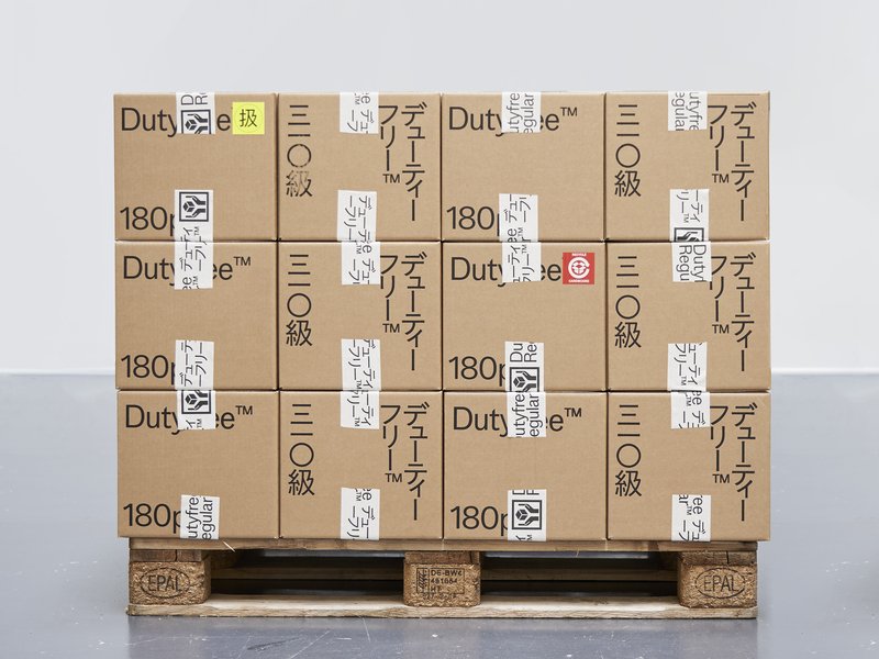
Inspired by hand-painted Japanese station signs from the late 1950s, Kyū Maru Gothic interprets and expands their handmade heritage into a coherent rounded sans serif and multiscript Latin/Japanese typeface. It carefully considers the warm and individual character created by the brush of the original sign painters and integrates it coherently into a typeface that is aimed at contemporary use. Further following the source, the typeface comes on a width axis to allow for more flexible typesetting for its intended use at display sizes.

János Vári – Família

TYPE DESIGN

János Vári – Família

by János Vári

What is a family? Are all families toxic? Who is the loudest at the table and what are the dynamics between those who are related? Contemporary type design relies heavily on interpolation methods, leading to a huge amount of styles. This often results in predictable type families. My work is an attempt to return to the roots of typesetting, when no superfamilies existed. Printers used to mix and match different typefaces when composing text. Instead of designing a family from a single source, I have constructed it from a variety of elements, a variety styles, which I have polished and modified until they work as a family. A type family of bold, regular and italic, text and display optical styles, designed for the catalogues and signage of a second-hand bookstore.

André Teixeira da Silva – Herk Type Crew

TYPE DESIGN

André Teixeira da Silva – Herk Type Crew

with Radim Peško, Alice Savoie

Herk is a typeface that incorporates roman and gothic styles, inspired by the aesthetics of b-boying and the recurrence of blackletter on the clothing of its practitioners. The contrast between this centuries-old typography and the relatively young underground world of breaking intrigued me. Inspired by a mysterious letterform popular among b-boys and b-girls, I started by designing a new skeleton. This became the basis for the pencil, marker and brush versions. This early exploration led to the creation of the gothic and roman display variants, underlining a more refined development of Herk. Finally, with the addition of the text versions, Herk underwent its final metamorphosis, combining roman and gothic styles into a unified typeface family.

Feng Juan Jun – Solux

TYPE DESIGN

Feng Juan Jun – Solux

with Kai Bernau, Radim Peško

Solux is a typeface family that emerged from a study of an often-overlooked genre – the slab serif fonts. The goal of Solux Roman is to be functional and enduring, prioritising timelessness over trends, with its static construction and human-crafted details. On the other hand, Solux Italic has been designed to be narrower and more calligraphic, allowing for a broader range of typographic applications. The design of the family draws inspiration from slab-serif logos such as the ones on Honda’s cars, which often exhibit a sense of stability and confidence. Solux aims to offer a balanced and contemporary typographic solution, for both print and wayfinding.

Norma Elzoghbi – Nostalgic Futures

TYPE DESIGN

Norma Elzoghbi – Nostalgic Futures

with Julia Born, Alice Savoie

This magazine aims to deconstruct, reinterpret and question Eastern and Western narratives through two distinct lenses: the West in the eyes of the East and the East in the eyes of the West. In a globalised and multi-cultural world, understanding identity disputes has become a crucial issue to end patterns of cross-border misrepresentations. It challenges the notion of “the other”, by documenting past, current and speculative future conflicts. Rather than persuading people, it conveys news from a two-sided narrative, acting as a cross-cultural bridging mechanism. It features a network of international contributors: writers, photographers and researchers. This project showcases my identity as an Lebanese/American, who belongs neither here nor there.

Rongyi Tang – Veil

TYPE DESIGN

Rongyi Tang – Veil

with Julia Born, Alice Savoie

Imagine a remarkable companion who remains by your side every hour of the day, responding to your every whim, seamlessly blending cuteness with sensuality, someone who never cheats or lies. Would you be enticed to embark on a date with such an ideal partner? What if that companion happened to be an egg timer? This project delves into the profound themes of human connections, loneliness and the nature of love in an era dominated by digital advancements. Through the unconventional concept of marrying inanimate objects, Rongyi presents a narrative that is both absurd and humorous, inviting the audience to ask a fundamental question: where do we truly invest our emotions?

Coline Besson – Girlz – They Gave Us Pink Let Us Make It Powerful

TYPE DESIGN

Coline Besson – Girlz – They Gave Us Pink Let Us Make It Powerful

with Kai Bernau, Julia Born

This editorial project embraces a new interpretation of the stereotypes of Femininity. The conscious reappropriation of its attributes becomes an act of awareness, subversion and empowerment. As a woman, being dissonant, allegedly vulgar and girly is a way to disrupt and challenge the established order and the agreed expectations of society. The publication gathers and highlights the works of a variety of female artists for this cause. It also features a custom-made font, Courtesy, with a neo-kitsch display cut that plays with proportions and consistency and a reader-friendly text cut – both sharing specific and sharp features. Finally, a monospace version allows for more freedom in compositions. It is used where traditional typesetting would favour italics.

Edouard Bérard – Sita

TYPE DESIGN

Edouard Bérard – Sita

with Kai Bernau, Alice Savoie

Sita is a family of sans and serif typefaces with origins in the Scotch Roman style. Sita Serif is a contemporary interpretation of Miller and Richard’s 1822 Double Pica Roman. Sita Sans is derived from its counterpart, with influences from early British grotesques from the same foundry. Designed to be set together, Sita Sans and Sita Serif are optically matched for optimal typesetting. While they share the same construction, they complement each other by retaining their unique characteristics. Sita’s harmonious texture and intricate details make it suitable for both small and large text sizes. Each style is available in five weights, from light to black, with corresponding italics. An additional display variant, Sans Black Condensed, completes the family.

Paul Sturm – Substanz

TYPE DESIGN

Paul Sturm – Substanz

with Kai Bernau, Alice Savoie

Substanz is a typeface that can be customised and adjusted to diverse artistic needs. The type family contains two single-line cuts (Upright and Italic), which act as a gateway into the typeface, as they only become usable when something is added, e.g. a stroke or a pen. They constitute an interface for graphic designers to engage with the typeface and add their own ideas and “handwriting” to the design. The typeface is completed by four text cuts (Regular, Italic, Bold and Bold Italic), which aim for good legibility and balanced text colour. They are designed for situations where legibility is favoured over expression – for example in small sizes.

Noam Benatar – Ktura

TYPE DESIGN

Noam Benatar – Ktura

with Julia Born, Alice Savoie

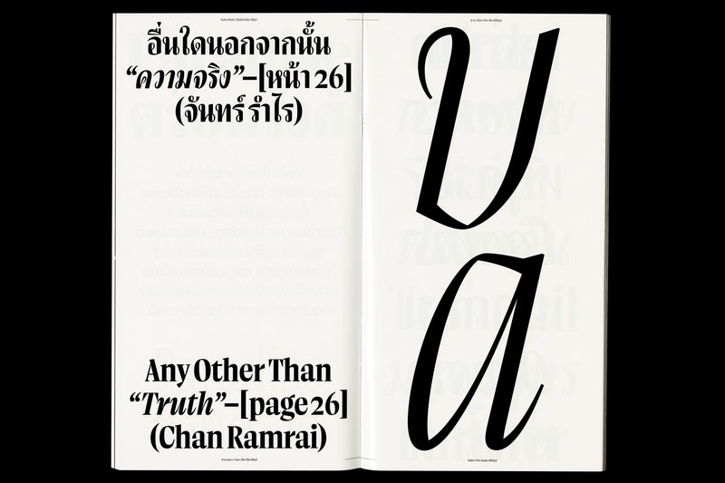
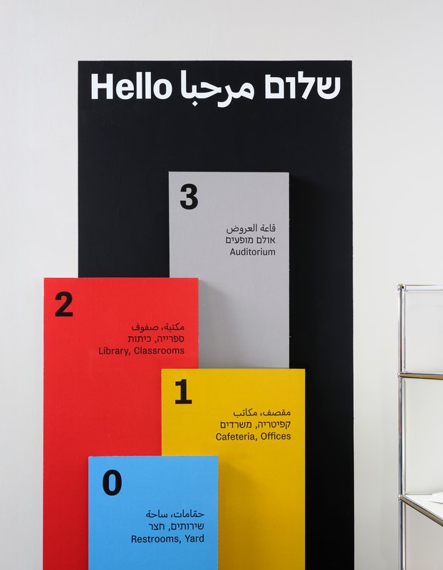
Ktura is a biscriptual, humanistic Slab-serif, Hebrew-Latin type family aimed for use as a text and title face. It includes nine cuts for both scripts, with four upright and corresponding italic text weights, and a display cut for titles. Ktura was designed following research on the way in which multi-script typefaces, specifically Hebrew-Latin ones, should be designed. The design process emphasises the idea that the understanding of the cultural background of each of the scripts is a crucial part in the design of multiscriptual typefaces. By experimenting with notions of contrast, proportion, white space and more, a comprehensive solution is introduced in the design which allows the typeface to work optimally in different environments where an intersection of the scripts occurs.

Lana Soufeh – Toujan Display: Contextual Arabic Typeface

TYPE DESIGN

Lana Soufeh – Toujan Display: Contextual Arabic Typeface

with Kai Bernau, Matthieu Cortat

Today, most typographic design is done in Latin script and type design software is geared towards Western scripts. Toujan is a contextual Arabic typeface that aims to explore the potential of this software to reintegrate versatility and connectivity in Arabic script, while preserving its dynamic nature. It is inspired by the Tawqii’ style, a hybrid of thuluth and naskh calligraphy and features ligatures that enhance the visual allure of the text but also serve a functional purpose, optimising the spacing and improving the text flow. Toujan pushes the boundaries of Arabic type by reintroducing one of its unique features, i.e. that of connecting all words in a sentence with a series of swashes that link the last letter of each word to the first letter of the following word.

Workshops

Yearbook

TYPE DESIGN

Yearbook

with Nejc Prah

In October 2021, the Master Type Design welcomed Nejc Prah for a one-week workshop. Being in a masters program is a special time, both personally and professionally. To keep a memory of it, the students were invited to create a Yearbook. First years and second years were assigned into pairs and asked to make a contribution about their partner. Drawings, collages, letterings, doodles, patterns, 3D-modelling, … Experimentations and explorations were encouraged. It resulted into a colourful and joyous publication, displaying a diversity of characters and approaches. After a collaborative effort for the production on the last day, each student got a copy, as a memory.

Böcklin Zoo

TYPE DESIGN

Böcklin Zoo

with Karl Nawrot

Workshop with Karl Nawrot. Handpainted compositions inspired by the typeface Arnold Böcklin from Schriftgiesserei Otto Weisert (1904).

All Over

TYPE DESIGN

All Over

with MATD, Job Wouters (Letman)

Workshop with Dutch designer Job Wouters.

Indentity Of The Zone

TYPE DESIGN

Indentity Of The Zone

with Jan Horčík, MATD

Patches from workshop with Jan Horčík.

Workshop with studio NORM

TYPE DESIGN

Workshop with studio NORM

with Dimitri Bruni (NORM), Manuel Krebs (NORM)

Workshop with Zürich based studio NORM on the theory, the design and the use of stencil typefaces.

Workshop with Thibault Brevet

TYPE DESIGN

Workshop with Thibault Brevet

with Thibault Brevet

Workshop with Thibault Brevet.

Type Poster Workshop with Dafi Kühne

TYPE DESIGN

Type Poster Workshop with Dafi Kühne

with Dafi Kühne, MATD

Atlas of Letterforms, workshop with Radim Peško

TYPE DESIGN

Atlas of Letterforms, workshop with Radim Peško

with MATD, Radim Peško

Sign Painting Workshop with Alaric Garner

TYPE DESIGN

Sign Painting Workshop with Alaric Garner

with Alaric Garnier, MATD

Programme

This section lists the detailed modules and courses for each semester of the programme.

Semester 1 2 3 4

Type Design I
9 ECTS
  • Characters
  • Type (hi)stories
  • Custom Type
Typography I
6 ECTS
  • Tools makes shapes

  • Type in use workshop
  • Type lectures 
Pré-Memoire I
5 ECTS
  • MA Thesis preparation

Transversal Workshop I
3 ECTS
  • 5 days workshop
Training in research I
3 ECTS
  • Introductory course on design research
  • Interdisciplinary workshop
Cross lectures I
4 ECTS
  • Cycle of lectures
Type Design II
9 ECTS
  • Type hi(stories)
  • Non Legitur
  • Translation
Typography II
6 ECTS
  • Optical sizes
  • Type in use
  • Type lectures
Pré-Memoire II
5 ECTS
  • MA Thesis preparation
Transversal workshop II
3 ECTS
  • 5 days workshop
Training in research II – Experimentation
3 ECTS
  • 3-day week with lecturers

  •  
Cross Lectures II
4 ECTS
  • Cycle of lectures
Type Design III
5 ECTS
  • Self-initiated project
Typography III
5 ECTS
  • Self-initiated project
Open project
5 ECTS
  • Self-initiated project
Pré-memoire III
6 ECTS
  • MA Thesis preparation
Transversal workshop III
3 ECTS
  • 5-days workshop
Training to research III — Application
3 ECTS
  • Presentations and interdisciplinary workshop
  • Junior Research Conference
Cross lectures III
3 ECTS
  • Cycle of lectures
Master's practical project
21 ECTS
  • Development of a major personal project
Master's thesis
9 ECTS
  • Theoretical Master’s thesis

Find all the programme documents below

Alumni

Jacopo Aztori
Federico Paviani
Florence Meunier
Luca Pellegrini
Kim Sohee
Davide Tomatis
Rani Yasmine Putri
Career Opportunities

Type designer, Graphic designer, Motion designer, Art director, Creative director, Publisher, Illustrator, Web designer, Teacher…

Other alumni

(BA Graphic Design and MA Type Design) Leonardo Azzolini (Omnigroup), Ondřej Báchor, Sascha Bente, Harry Bloch (Studio Harris Blondman), Chaumont & Zaerpour, Guillaume Chuard, Matthias Clottu, Emmanuel Crivelli, Marietta Eugster, Eurostandard, Matthew Fenton, Louisa Gagliardi, Gavillet & Cie, Eliott Grunewald, Noémie Gygax, Weichi He, Robert Huber, Larissa Kasper (Kasper-Florio), Sean Ervan Kuhnke, Kaj Lehmann, Simon Mager (Omnigroup), Maximage, Adeline Mollard, Olga Prader, Aurèle Sack, Teo Schifferli, Haakon Spencer, Florence Tétier, Chi-Long Trieu, Nicole Udry…

Staff

Head

Matthieu Cortat

Assistants

Nicolas Bernklau
Raphaela Häfliger

ECAL Typefaces Manager

Malte Bentzen Bredstrup

Professors

Kai Bernau
Julia Born
Matthieu Cortat
Wayne Daly
Roland Früh
Anniina Koivu
Marie Lusa
Radim Peško
Alice Savoie
Chi­-Long Trieu

Lecturers

George Anton Kiraz
Gerry Leonidas
Hrant Papazian
Irene Vlachou

Visiting Lecturers

Sahar Afshar
Khajag Apelian
Roberto Arista
Etienne Aubert­-Bonn
Leonardo Azzolini (Omnigroup)
Stuart Bailey
Alexandru Balgiu
Chiara Barbieri
Paul Barnes
Sofie Beier
Selina Bernet
Bianca Berning
Eleni Beveratou
Alex Blattmann
Thibault Brevet
Vincent de Boer
Mirko Borsche
Johannes Breyer (Dinamo)
Dimitri Bruni (NORM)
Matthew Carter
Nadine Chahine
Mathieu Christe
Pippo Ciorra
Bart De Baets
Sara de Bondt
Lizá Defossez Ramalho (R2Design)
Maria Doreuli
Gary Fogelson
Tom Foley
Alaric Garnier
Gilles Gavillet (Optimo)
Emilio Gentile
Tanya George
Eliott Grunewald
Fabian Harb (Dinamo)
Jonathan Hares
Leila Hekmat
Franz Hoffman
Jan Horčík
Robert Huber
Thomas Huot­-Marchand
Larissa Kasper (Kasper-Florio)
Ueli Kaufmann
Simone Koller (Studio NOI)
Manuel Krebs (NORM)
Matthias Kreutzer
Dafi Kühne
Indra Kupferschmid
‍Phil Lubliner (Other Means)
Louis Lüthi
Bruno Maag
Simon Mager (Omnigroup)
Amir Mahdi Moslehi
Robin Mientjes
Yoann Minet
John Morgan
Reto Moser (Grilli Type)
Sandrine Nugue
Mitch Paone (DIA Studio)
Michele Patanè
Julie Peeters
Edwin Pickstone
Jonathan Pierini
Krista Radoeva
Mohamed Rafed
Artur Rebelo (R2Design)
David Rudnick
Aurèle Sack
Kristyan Sarkis
Jens Schildt
Isabel Seiffert (Offshore)
Wissam Shawkat
Izet Sheshivari
Fred Smeijers
Huda Smitshuijzen AbiFarès
Adam Szymczyk
David Jonathan Ross
Régis Tosetti
Nora Turato
Richard Turley
Linda van Deursen
Carlo Vinti
Ryan Waller (Other Means)
Job Wouters
Pascal Zoghbi

ECAL Typefaces


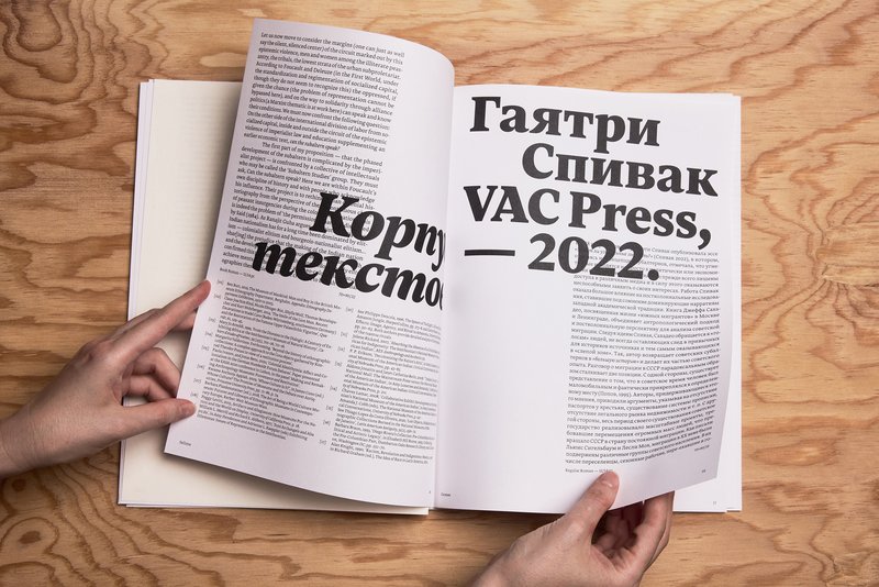
ECAL Typefaces has, since 2016, been the first online type foundry based within a university. Its initial remit was to respond to frequent requests to acquire the typefaces seen in ECAL corporate communications, such as posters, invitation cards and catalogues. The foundry is now fully embedded in the ECAL Master’s Degree in Type Design (MATD), and also features work from the ECAL Bachelor’s Degree in Graphic Design. All fonts have been designed by students.

Go to ECAL Typefaces Website

ECAL_Typeface_01.png